Inauguration Word Clouds with tf-idf
Published:
Trump’s inauguration was yesterday, and we’re all coping with it in different ways. Instead of watching yesterday’s events, I decided to download a bunch of inaugural addresses and make some word clouds (jump ahead a little bit if you’re curious about the more technical details).
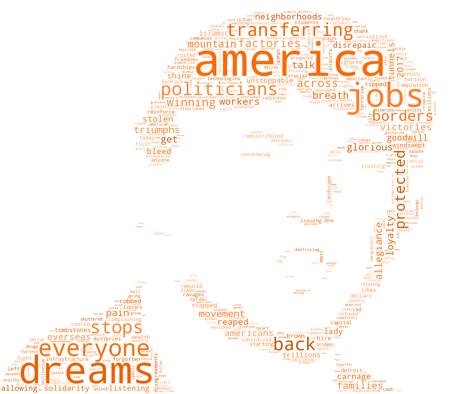
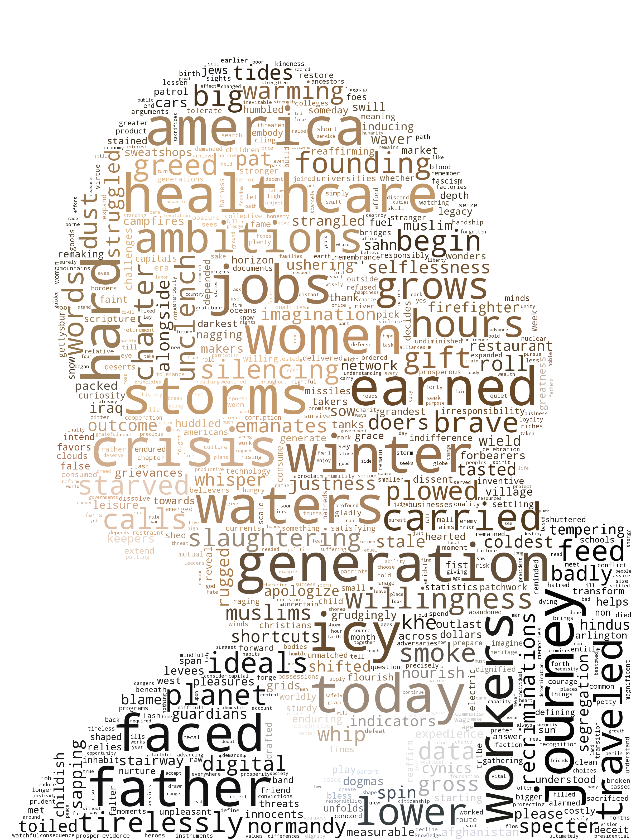
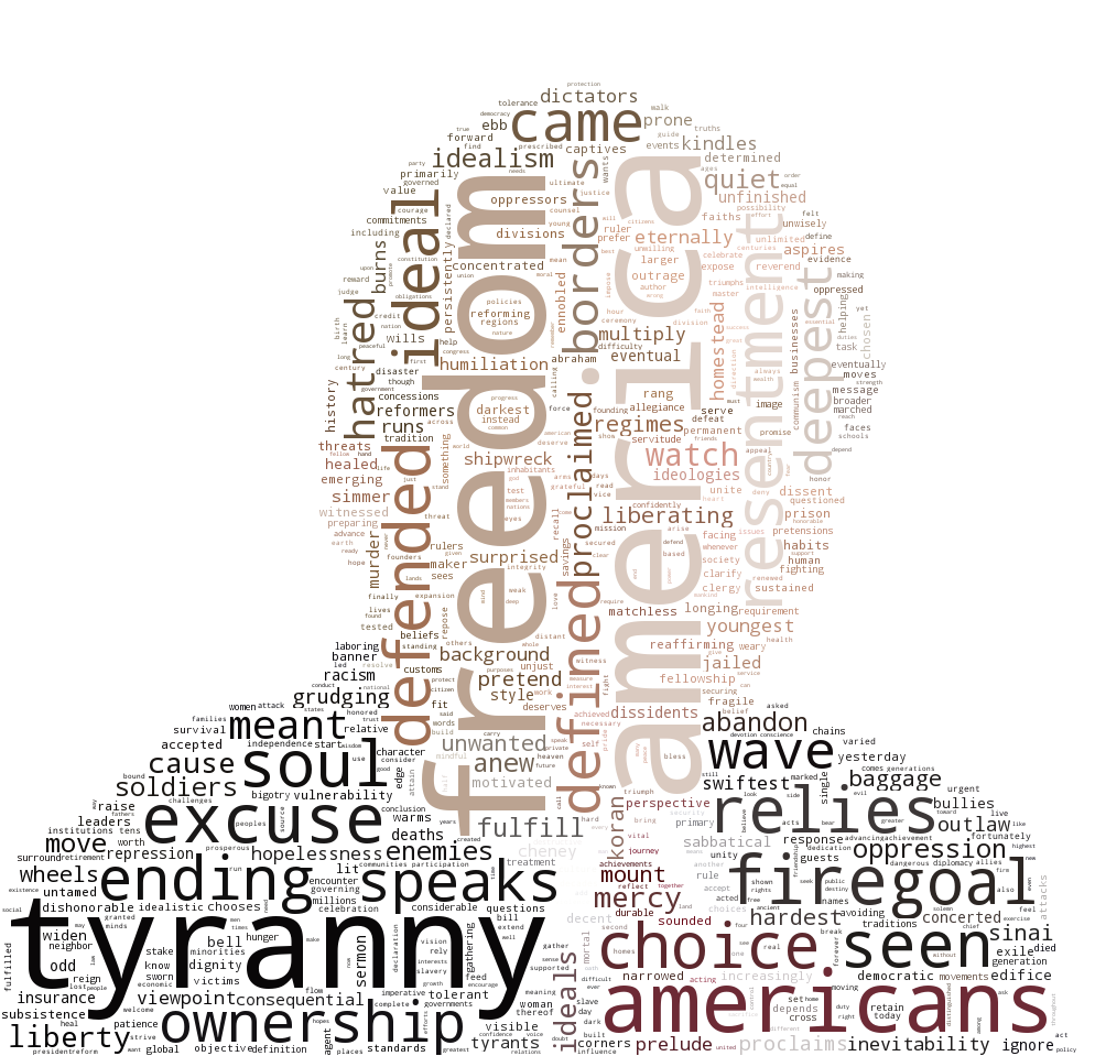
These word clouds aren’t meant to show the most frequent words of each address – rather, the words depicted are both frequent in a given speech and rare compared to every other inaugural address, based on the metric tf-idf (more on that later). Thus, if a word appears large in a president’s cloud, it means that the word was used more by that president than in the typical inaugural address.
Donald Trump (2017)

Barack Obama (2009)

George Bush (2005)

A few trends stand out off the bat. Trump’s address is focused on jobs and success, as the words “jobs”, “workers”, “factories”, and “winning” all appear large. Additionally, “politicians” received a lot of Trump’s attention, largely in a negative context. Note “carnage” in the lower right corner, which for me was the most notable word of the speech.
In comparison, Obama’s address is more policy-driven – note the words “healthcare”, “warming”, and “women”. There is an additional focus on storytelling and optimism, as demonstrated by the words “father”, “journey”, “generation”, and “ambitions”. Taking place during the Great Recession, the speech also highlights “crisis”, “winter”, and “icy”. The top words in Bush’s address highlight the nationalistic mood of post-9/11 America, with “tyranny”, “defended”, and “freedom” prominently featured.
Finally, note that Trump’s word cloud has a mix of very large and small words, while Obama’s lexicon is more uniformly distributed. This suggests two things: 1) Trump repeated himself and 2) he used certain words and phrases that were very atypical for an inaugural address.
Technical Details
First, I want to thank Andreas Muller for making the “word_cloud” library for Python publicly available; the only reason these graphics exist is because the library is straightforward to use and incredibly well-documented.
To gather the data, I downloaded most of the addresses from The Avalon Project at Yale. Some speeches were missing, so I found them in various online resources.
I preprocessed the data by removing stop-words I found from a standard list. I added the names of all former presidents to the list of stop-words – since the new president typically thanks the former president in his speech, I did not think they would be informative in the diagrams.
I used tf-idf to find the most important words for each speech, which is essentially the product of how common a word is for a certain speech (tf, or term frequency), and how rare that word is in comparison to the other speeches (idf, or inverse document frequency). We have a score for each speech \(d\) and word \(t\) (with \(N\) total words), given by \(tfidf(d,t)\) where
- \(tf(d,t) =\) number of times word \(t\) appears in speech \(d\)
- \(idf(t) = \log \frac{N}{\text{number of speeches with word } t}\) (note this score is shared across speeches)
- \(tfidf(d,t) = tf(d,t) \cdot idf(t)\).
Thus, words in a speech with a high \(tfidf\) are used frequently in that speech yet rarely mentioned in other speeches. I used an off-the-shelf implementation of tf-idf from gensim.
Finally, I used the “word_cloud” library to make the graphics. I found these examples incredibly helpful, and the library is very straightforward to use with basic Python experience. I used these images of Trump, Obama, and Bush as masks.
All my code is available here.